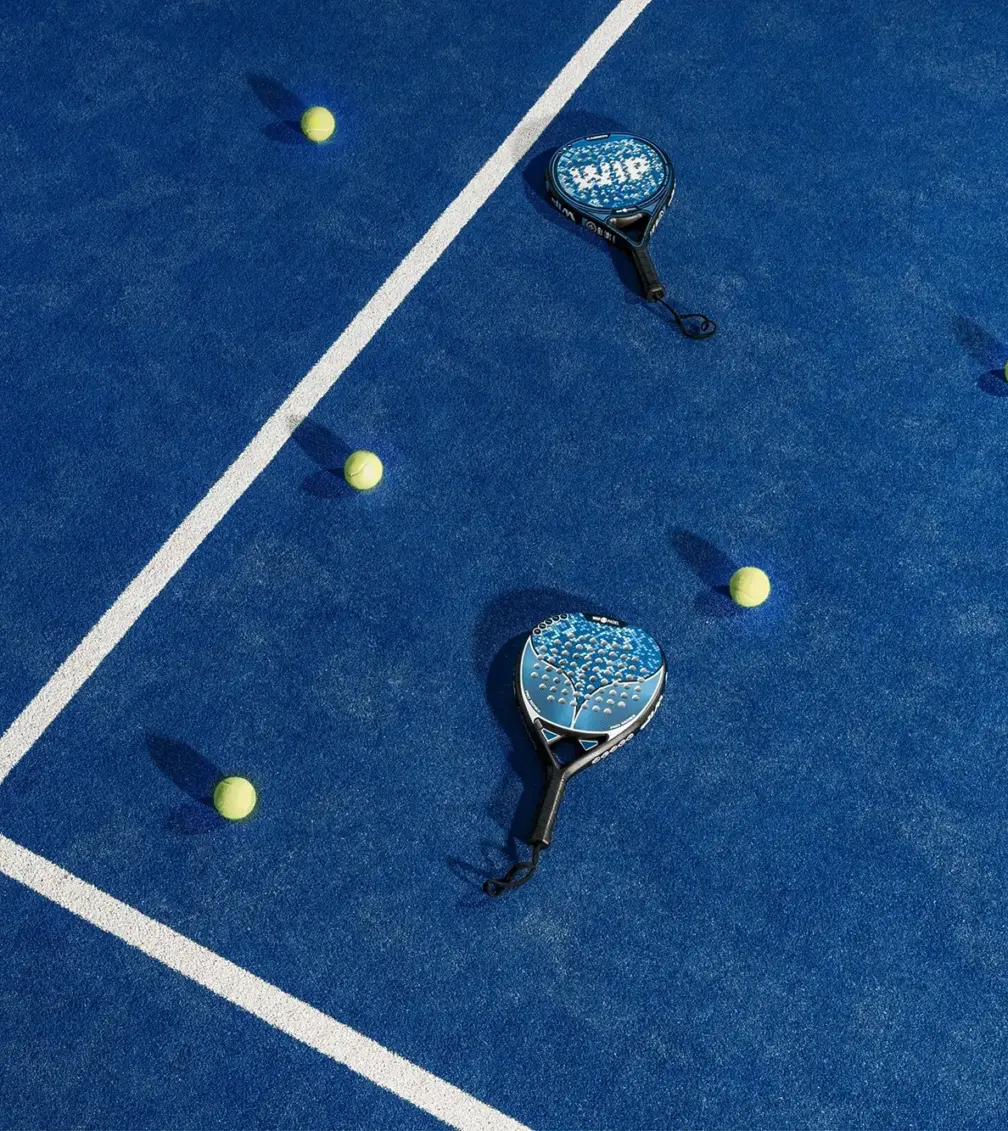
Walk into almost any new padel venue in Britain right now and something feels familiar before you have even picked up a bat. The neon. The dark walls. The gradient that slides from deep green into electric lime. The logo built from a few clean lines that hint at a court. You have seen it before, at a different club, in a different town, run by different people.
That is not a criticism of any one brand. It is what happens when a sport grows this fast. But it is worth paying attention to, because the clubs that get their branding right over the next couple of years are the ones that will still feel distinctive when the category settles. This is a look at what the “default” padel brand has become, why so many landed in the same place, and what it takes to build a padel brand that people actually remember.
How big is the UK padel market right now?
Big, and moving quickly. There were around 1,553 padel courts across 559 venues in the UK by April 2026, more than double the roughly 870 courts counted at the end of 2024. That is close to 78% growth year on year (RacketRise).
The player numbers tell the same story. The LTA reported 860,000 people playing padel in Britain, with more than 10 million saying they would like to try it (LTA Padel). Money is following the players. The LTA and private investors have put upwards of £18 million into court infrastructure, and larger commercial players are moving in, with Frasers Group backing Slazenger Padel Clubs and around eleven venues planned (Savills).
When a market expands this fast, everyone is racing to open. Branding often gets sorted in a hurry, using whatever references are already floating around. Which is exactly how a whole category ends up looking like one club with different names.
What does the “default” padel brand look like?
There is a recognisable house style, and once you notice it you cannot unsee it. Most new padel brands pull from the same small kit of parts:
- Ball green and electric lime. The colour of a padel ball has quietly become the colour of the entire sport. It reads as energetic and sporty, which is precisely why so many brands reach for it.
- Dark backgrounds with a gradient. Deep charcoal or near-black, lifted by a green-to-lime or emerald-to-teal fade. It signals “premium and modern,” at least until everyone does it.
- Court lines and racket shapes. The perforated racket face and the lines of the court are easy, obvious symbols. Useful, but heavily used.
- A clean, energetic sans serif. Confident, geometric, interchangeable. Swap the logo between two clubs and most people would not notice.
- Federation blue, the other default, borrowed from the official and international end of the sport to signal seriousness.
None of these choices are wrong on their own. The problem is arithmetic. When most brands in a category make the same handful of safe decisions, the category blurs into one shape, and standing out gets harder for everyone in it.
Why do so many padel brands look alike?
Because speed beats distinctiveness when you are in a land grab. Most operators have been focused on the genuinely hard things: securing a site, getting courts in the ground, hitting an opening date. Branding gets handled quickly, often by borrowing from the clubs that opened first, who were themselves borrowing from the clubs before them. It is a completely understandable path, and it is why convergence happens in every young category, not just this one.
The interesting part is what comes next. The design world has already noticed padel, and the more considered brands are deliberately stepping away from the neon default toward something warmer and more premium: olive and desert sand, deep emerald used with restraint, blue and gold, palettes that suggest a members’ club rather than a launch party. The clubs making that move now are the ones building something that will still look considered in three years.
What makes a strong padel brand?
A strong padel brand starts with a point of view, not a colour palette. The clubs breaking away from the pack all did the same thing first: they decided what kind of experience they were really selling, then let everything else follow from that. A few useful examples, all real, all recent.
Padel Social Club worked with agency Thisaway on a positioning built around the idea of “Play Original.” The identity leans on the shapes of the sport, a mark that reads as both a racket and a location pin, court lines running through the graphics, circular motifs drawn from the holes in a racket face. Instead of the usual action photography, they built imagery blending still life, sport and fashion. As Thisaway’s creative director Graeme Cook put it, that approach “immediately gives the brand some stand-out and has attitude as well as an aspirational feel” (Creative Boom). The lesson is that a clear idea at the centre does more work than any single design choice.
The Padel Club took a considered, premium route with agency zynk, treating the brand as part of a wider wellness and lifestyle experience rather than just a place with courts (zynk).
Rocket Padel built its identity around a single strong idea, the rocket, and let that carry the story rather than leaning on the category’s usual visual shorthand.
Pulling those together, the brands that stand out tend to share a few habits:
- Start with the experience, not the sport. Are you a competitive club, a community court, or a social venue where the padel is almost the excuse? The answer should shape everything.
- Pick a colour world beyond ball green. The moment you move off the default palette, you look different, because almost nobody else has.
- Give the typography a personality. A distinctive typeface does an enormous amount of quiet work in making a brand feel like itself.
- Own a real idea. “Play Original” is a position. “Premium padel experience” is a description everyone can claim.
- Design for the phone. Most people will meet your brand while booking a court on a small screen, so it has to work in motion and at thumbnail size.
How much does padel club branding cost in the UK?
It depends on scope, but here are honest UK ranges to plan around. A logo on its own typically runs from around £500 to £3,000 depending on whether you use a freelancer, a small studio or an agency. A brand starter pack, meaning a logo plus a basic set of guidelines, tends to sit between £1,500 and £5,000. A full brand identity, with strategy, a complete visual system and proper guidelines, generally falls between £5,000 and £20,000, and a strategic rebrand for an established operator can run from £10,000 upward (ikon, Bob Design).
The useful way to think about it is not cost but return. In a category where most brands look the same, a distinctive identity is one of the few things that makes booking your court feel different from booking the one down the road. That gap is where memberships and loyalty are won.
Your padel website: the brand’s hardest-working asset
Your website is where the branding stops being a mood board and starts making you money. For most padel clubs it is the first proper interaction a player has with the brand, and it is doing three jobs at once: convincing someone to try you, getting them to book, and making them want to come back.
A few things matter more than they might seem:
- Booking has to be effortless. If a first-time player cannot find a court and pay in under a minute, the brand work upstream is wasted.
- The site has to feel like the brand, not a generic booking widget with a logo dropped on top. Consistency from Instagram to homepage to court is what makes a brand feel real.
- Local search is doing quiet work. People search “padel near me” constantly. A site built with local discovery in mind is the difference between filling off-peak courts and staring at empty slots.
This is the point where branding and build have to talk to each other, because a beautiful identity on a clumsy website converts worse than a plain brand on a site that just works.
What about equipment brands, apparel and court builders?
The same principle applies right across the padel ecosystem, not just to the clubs. Equipment and apparel brands are fighting for shelf space and attention in a market filling up fast, where a clear identity and a real point of view are what earn a second look. Court builders and installers are selling to operators and investors making six and seven figure decisions, and their branding has to signal that they are a safe, credible partner rather than a website thrown together last year. As the money moves into padel, everyone selling into the category is being judged on how seriously they present, and that judgement happens in seconds.
The window is closing
Right now, padel in the UK is still open enough that a distinctive brand can plant a flag and own a bit of ground. That will not last. As the market matures and the bigger, better-funded operators arrive with proper brand teams behind them, looking like everyone else stops being a minor issue and starts being a real disadvantage. The clubs, brands and suppliers that decide what they actually stand for now, and build an identity around it, are the ones that will still feel like themselves when the category is crowded.
If you are opening a club, launching a product, or building courts and you want a brand that does not blur into the pack, that is exactly the kind of problem we like getting curious about. Let’s have a conversation.
FAQs
Many launched quickly during a fast land grab and borrowed from the clubs that opened before them, usually landing on the same ball-green and neon palette, dark backgrounds and court-line motifs. It is convergence, not a lack of care, and it is common in any young category.
There is no single right answer, but moving away from the default ball green is one of the easiest ways to stand out. More considered brands are using warmer, more premium palettes such as olive, desert sand, deep emerald and blue with gold to signal a members’ club feel rather than a launch-night one.
A starter branding pack with a logo and basic guidelines tends to run from £2000 to £5,000, and a full brand identity generally sits between £5,000 and £20,000. The right number depends on how much of the market you are trying to stand apart from.
Ideally they are built together. The website is where most players first meet the brand and where they book, so the identity and the build need to share the same thinking rather than being bolted together at the end.
References
- LTA Padel, 860,000 players figures
- RacketRise, UK padel growth 2026 (courts and venues)
- Savills, the UK padel market
- Creative Boom, Thisaway and Padel Social Club
- World Brand Design Society, Padel Social Club
- zynk, The Padel Club branding
- Made Studio, Rocket Padel
- ikon, UK brand identity cost guide
- Bob Design, how much does branding cost UK