Branding is everywhere. It’s in the clothes we wear, the music we listen to, the products we choose to buy. It’s how we recognise, connect, and make decisions, often without realising it. More than just a logo or a colour palette, branding is a story, and people love stories.
But in an industry that’s more saturated than ever, where new businesses launch every day, it’s becoming harder to create a brand that actually resonates. Looking good isn’t enough. A brand needs substance. It needs to communicate who it is, what it stands for, and why it matters.
As Jolt Digital grew, we started to feel a disconnect between who we were and how we presented ourselves. The Jolt Digital brand had been left behind. It felt dated, misaligned with our approach, and lacked the distinct personality we bring to our work. There was no clear tone of voice, no brand messaging that truly captured what makes us different.
We needed a brand that reflected not just where we’ve been, but where we’re going.

Building the Brand Strategy
We started by asking ourselves the big questions: Who are we? What do we stand for? How do we want people to feel when they engage with us?
A brand’s voice is just as crucial as its visuals. For Jolt Digital, that meant defining a tone of voice that cuts through industry clichés and offered real, tangible value. The marketing world is overflowing with tired buzzwords and empty promises, blending into a sea of sameness. We wanted to be different.
From the start, it was clear that our voice had to be bold, confident, and unmistakably human. No fluff, no corporate jargon, no empty promises. We’re a team of straight-talking, creative problem-solvers who know our stuff but never take ourselves too seriously, so we built a tone that’s conversational yet sharp, confident with just the right amount of wit.
In an industry that can feel overcrowded, defining ourselves with real impact wasn’t just optional, it was critical.
That ethos – cutting through the noise in an oversaturated industry, became the foundation for our entire rebrand.
We explored ways to bring it to life visually, experimenting with the lightning bolt from our original branding, cutting through colour gradients to create contrast and impact. While the idea was strong, it didn’t quite land in execution. The challenge was finding balance: bold yet refined, progressive yet timeless, modern yet not pretentious.
Developing The Visuals
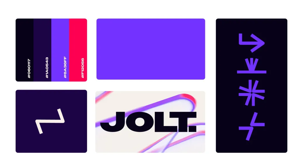
By deconstructing the original lightning bolt, we created abstract 3D elements that, when layered together, form a gradient with depth, movement, and a sense of progression. It captures the essence of what we do: cutting through complexity to create clarity.
The gradient is striking but subtle enough to never be overpowering, complementing the other brand assets rather than competing with it. To maximize flexibility, we built three core versions—dark, medium, and light—giving us an adaptable system that allows for endless variations of abstract 3D gradient backgrounds.
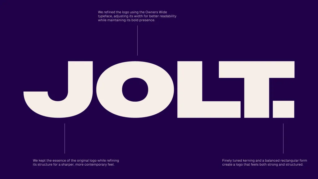
The typography follows suit, with Owners X Wide making a statement in big, bold titles to match our big and bold messaging, while pairing it with Sequel Sans ensuring clear legibility with its clean lines for body text. Together, these elements balance impact with functionality, much like the strategic and creative work we do every day.
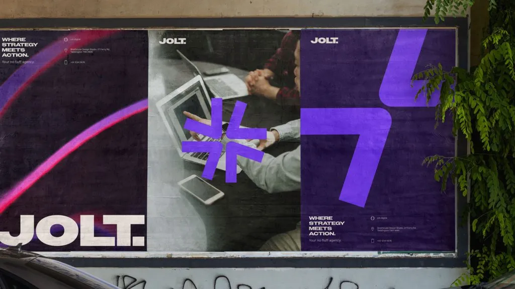
To reinforce our methodology, we expanded Jolt Digital’s brand visuals to reflect the core pillars that guide every project we take on: defining objectives, crafting strategies, building products and experiences, and pushing creative boundaries.
To do this we introduced a set of graphic icons: versatile visual assets designed with both function and meaning. Whether standing alone, integrating into UI, or acting as visual signposts across different formats, they create a cohesive yet flexible system that reinforces our identity at every touchpoint.
Just as these icons bring clarity and structure, our new colour palette was designed to be equally adaptable, working effortlessly across both light and dark modes. The colours are strong but carefully curated, ensuring they channel energy and confidence without feeling overpowering. They align with our no-nonsense approach, striking a balance between boldness and usability.
Pulling it all together
Jolt Digital has never been about one person. It’s about the people behind it.
That’s why this wasn’t a solo effort. The entire team had a hand in shaping the brand, feeding into the process and refining it into something we all feel connected to.
More than just a rebrand, this was about capturing the energy and expertise we bring to the table every day. We didn’t want rigid guidelines that boxed us in. Instead, we built something with a strong foundation but enough flexibility to evolve as we do.
We’ve always been about impact, creating work that doesn’t just perform but leaves a lasting impression. Now, we have an identity that does the same for us.
Because branding isn’t just about aesthetics. It’s about creating something that people remember, something that feels real, something that sticks. And with this, we’re making sure Jolt Digital does exactly that.
If you have a project in mind or just want to have a chat, drop us a message!